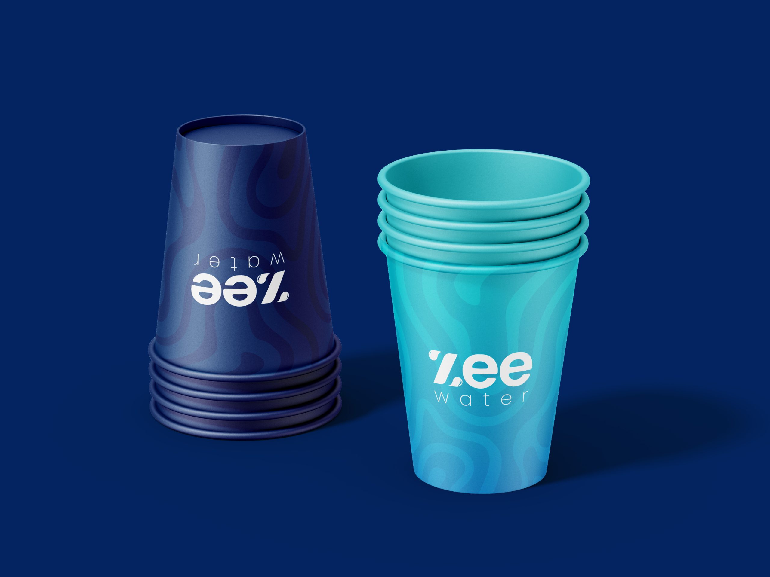
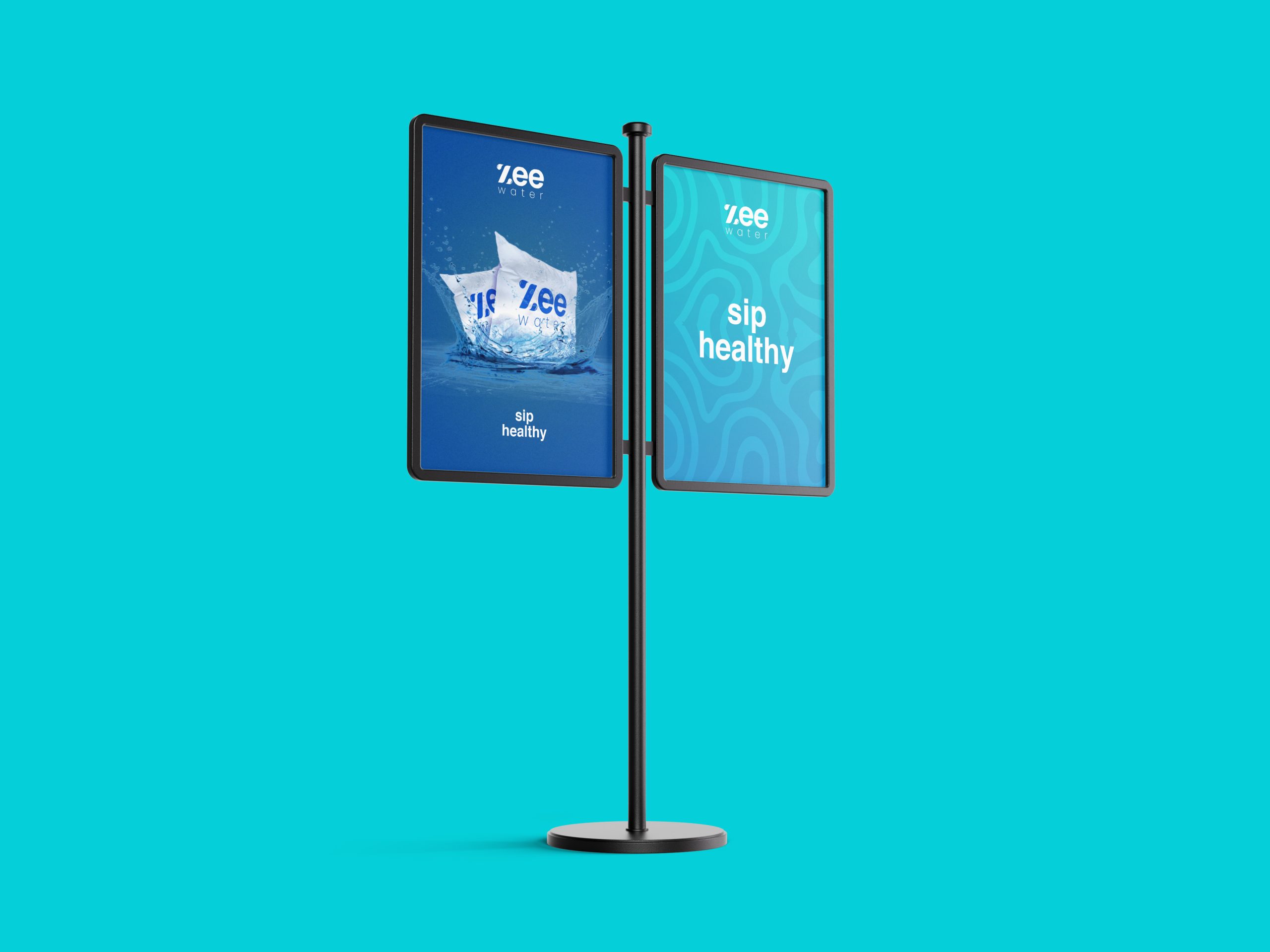
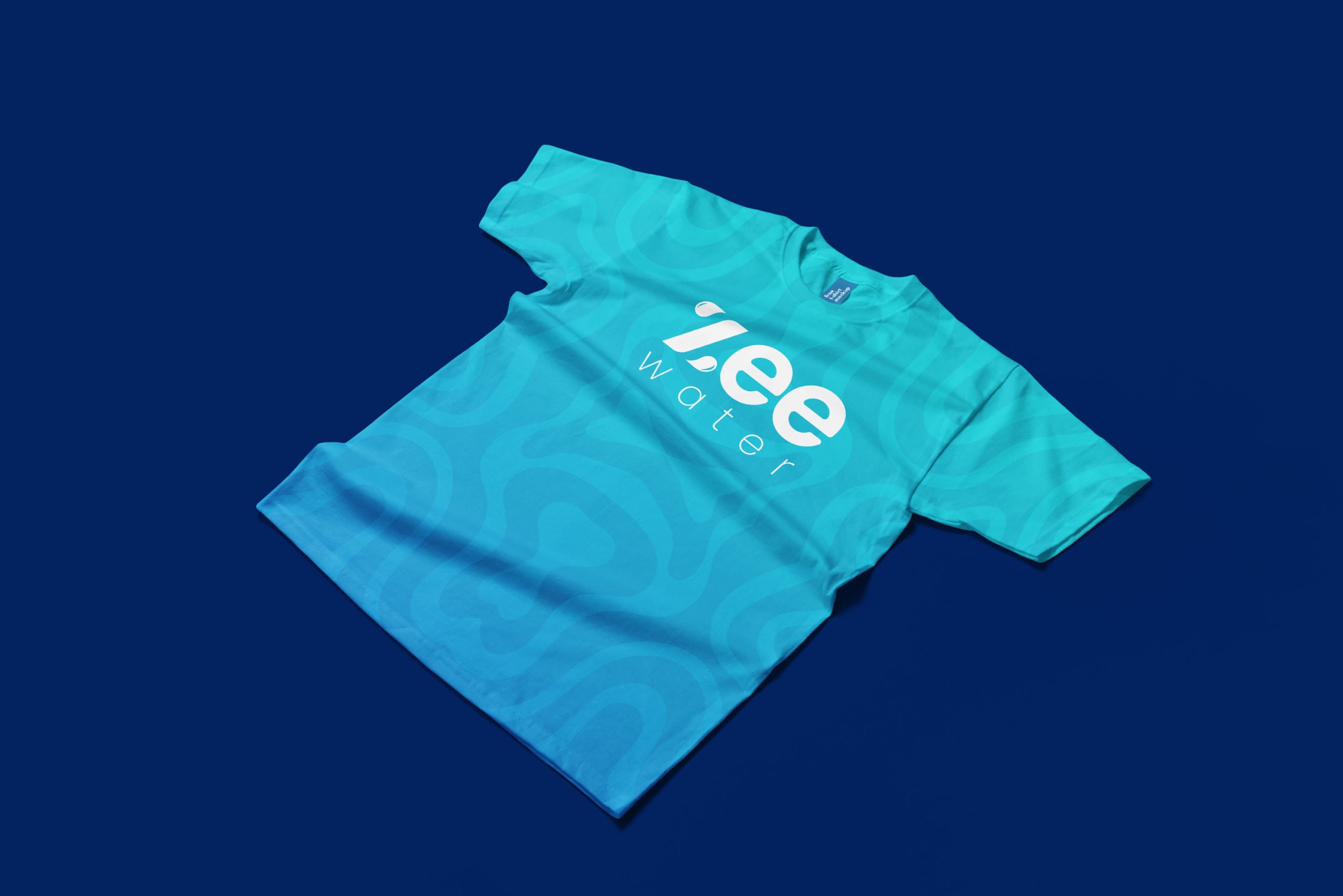
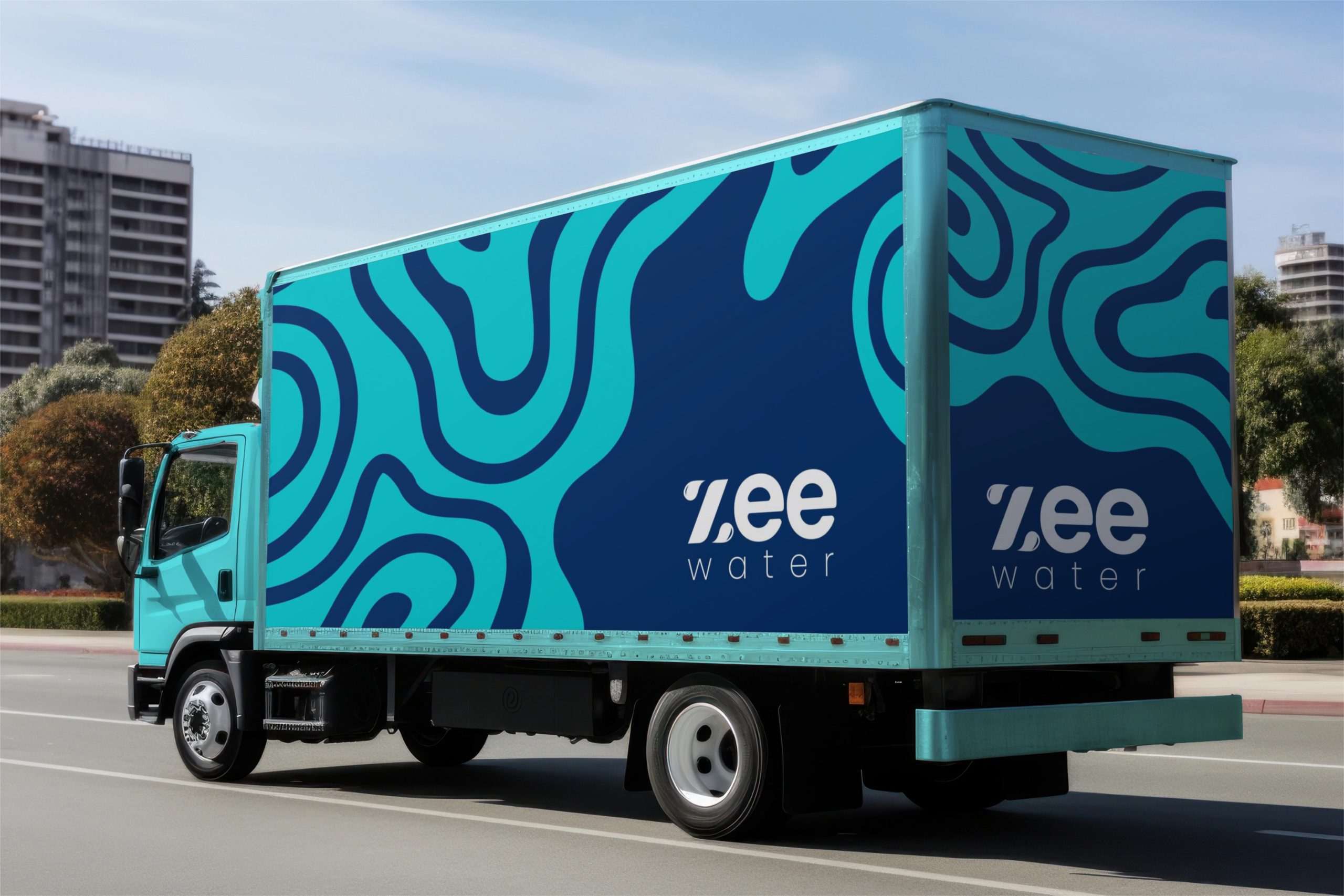
Zee Water is a water brand committed to producing puried water that prioritizes health, safety, and environmental well-being. Our team crafted a comprehensive brand identity that embodies the brand’s essence, focusing on tranquility, wellness, and a bold yet welcoming presence.
Feel at home
Wordmark Design: Simplicity and Harmony
The Zee Water wordmark is designed to convey calmness, purity, and approachability:
Lowercase Letters
The use of lowercase letters establishes a sense of calm and friendliness,
reecting the brand's tranquil and welcoming essence.
Corner Rounded Letters
Rounded edges reduce sharpness, creating a design that feels gentle and
uid, akin to water's natural ow. This approach eliminates rigidity, aligning with the brand's
emphasis on wellness and ease.
Intertwined "Z" with Water Droplets
The initial "Z" is creatively merged with water droplets, symbolizing purity and the brand's connection to water. This visual element reinforces Zee Water’s function while making the logo memorable.
Spaced Lettering
Thoughtful letter spacing ensures optimal legibility across all sizes and
mediums, making the wordmark adaptable and visually balanced.
Pattern Design: Movement and Flow
Visual Connection
The pattern mirrors the calming and rhythmic ow of water, which is visually
soothing and immediately associated with the brand’s core product.
Symbolism
It signies purity, uidity, and natural balance, reinforcing Zee Water’s goal to
promote wellness and safety.
Color Palette: Tranquility and Freshness
Evoking a sense of calm, cleanliness, and freshness, blue tones are universally linked to
water and tranquility.
Complementary hues add a welcoming warmth without disrupting the brand’s
peaceful aesthetic, symbolizing wellness and approachability.
This palette not only aligns with the water theme but also creates a visually serene identity that resonates with consumers seeking health and safety.resonates with consumers seeking health and safety.e end result is just remarkable! i Love my new home"
Typeface: Clean and Timeless
Reflect water’s smooth and natural ow, providing a clean yet approachable
aesthetic.
The uncomplicated design ensures clarity and professionalism, enhancing readability
across all applications.
The overall design fosters a tranquil and bold emotional connection
Tranquility
Rounded edges, owing patterns, and calming colors convey the serene qualities of
puried water.
Our Mission
Wellness: The design promotes the sense of care and safety that Zee Water aims to oer its
consumers.
Boldness
The thoughtful balance between simplicity and impactful design ensures that Zee Water stands out in the competitive market while maintaining its welcoming character.
The Zee Water brand identity is a seamless blend of aesthetics and functionality, symbolizing the purity, health, and tranquility that the brand delivers. The interplay of a uid wordmark, water-inspired patterns, and a soothing color palette establishes a clear, memorable, and approachable brand presence. This identity positions Zee Water as a trusted provider of safe and puried water, dedicated to enhancing well-being and environmental health.